Purpose
Reimagine mead branding for a more elevated, contemporary audience
Client
Wilbuck Meadery
Team
CEO & Founder:
Dane Miller
Creative Direction:
Kristen Jussila
Reimagining traditional mead branding
Brand + Visual Identity
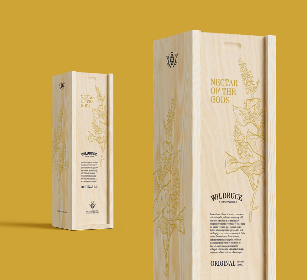
Wildbuck Meadery is reimagining traditional honey wine branding, exploring how a niche category could be positioned for a more elevated and contemporary audience. Today, meaderies often rely heavily on rustic, medieval, or otherwise expected aesthetics that reinforce the category’s traditions but leave little room for a more modern point of view. Through a new visual identity Wildbuck reframes mead as a thoughtful, elevated product rooted in nature and craftsmanship.
I developed the brand strategy, visual identity, and art direction for Wildbuck Meadery, beginning with an exploration of a new audience and the values that could shape the brand. I created a visual system inspired by botanical illustration, the craft of beekeeping, and the ritual of enjoying something sweet.
Defining a new Audience
The current brands offering mead to consumers lean heavily on the Nordic and medieval aesthetic. Marketing is also tailored for craft beer audience which is already oversaturated with choices and options. The few brands that cater to a wine audience just don't match the certain level of sophistication and quality that wine drinkers are used to.

04
Masculine Craft Beer
Mead has increasingly borrowed from craft beer culture, resulting in branding that often favors rugged, masculine aesthetics over the more natural and botanical qualities of its origins.

03
The category is closely tied to small-batch, local, and DIY production, often adopting the visual language of craft beer and home brewing.
Growler + DIY Community

02
Fast + Cheap Design
Many brands rely on quick, templated visual solutions that prioritize getting a product to market over creating a distinctive or cohesive identity.

Mead branding often leans heavily on Viking, Norse, and medieval imagery, using mythology and historical references as shorthand for the category’s origins.
Viking + Nordic Troupe
01


The Art of Intention
Every sip is deliberate, balanced, and worth savoring.
A refined balance of heritage, flavor, and elegance.
Cultivated Indulgence
Guardians of the Hive
Honoring land, pollinators, and nature's gifts with care and respect.
Food, drink, and connection treated as timeless rituals.
The Table is Sacred
Value Statements