The following work is a personal project exploring opportunities for improvement to an established brand.

purpose
Align brand values and prompt better customer behavior
Goals:
Align the visual brand with sustainability goals and the overall brand purpose and mission.
Improve user interaction and behavior with the product that increases brand loyalty and experience.
(This project is not in collaboration, paid for, or approved by Compass Coffee.)

"we believe that the best cup of coffee is the one that points you in the right direction at the start of your day every day"
Problem:
The visual brand addresses the compass element, but ignores the clear tie between 'doing the right thing' and enjoying a great cup of coffee.
Current tagline:


The tin is too text heavy.
More complicated grids and maps that don't align with the brand.

The logo takes up too much space.
Confusing grid that limits the products to a select number that fit within this format.
The name of the coffee is hidden on the bottom of the tin.
Addressing Sustainability:
There is no indication that the tins are reusable or that customers are able to bring them back to the store for refills.
There is no place for staff to write on the tins when you do bring them back, labeling the coffee, grind and date.


(Images from Compass Coffee blog)
SOLUTION
Brand Alignment:
Using the current tagline 'Real Good' and expanding to include ' Do Good'. Aligning the values of a good cup of coffee that thinks of people and planet first.

We're obsessed with making great coffee easy.
You should never have to worry about the coffee you drink. From sustainable sourcing to peak roasting, we get every detail right, so that you can start your day right.
Ethically sourced, for people and planet.
We build deep relationships with every farmer we work with and are committed to ethical sourcing so that you can feel good about the coffee you drink every day.
Logo Refinement:
Cleaning up the main logo and badge design to reflect how the brand got started.
Keeping it simple.
"we got our start in 2014 with an idea that was as simple as it was profound: that great coffee doesn't have to be complicated, fancy or hard to pronounce."

Tin Redesign:
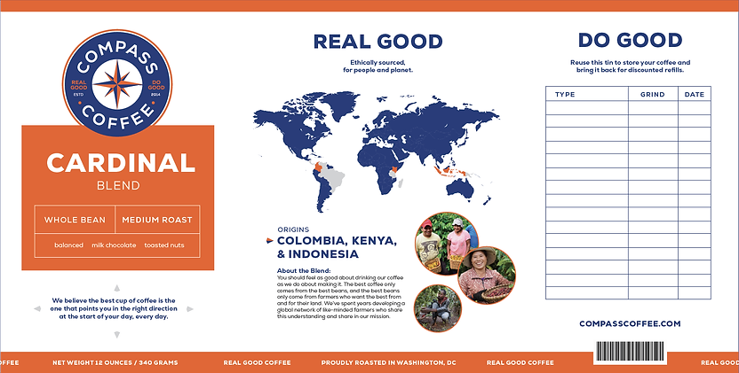
Prominent Logo and Label
Using the badge as a visual element and creating a color code system that also highlights a larger label with clearer descriptions.
Map and Location
Highlighting the people and places of where the coffee is being sourced allows the values and mission of the brand to shine.
Reusable Prompt
Creating space for people to visually see that this tin is meant to be reused and for staff to utilize when labeling all of the future refills.


